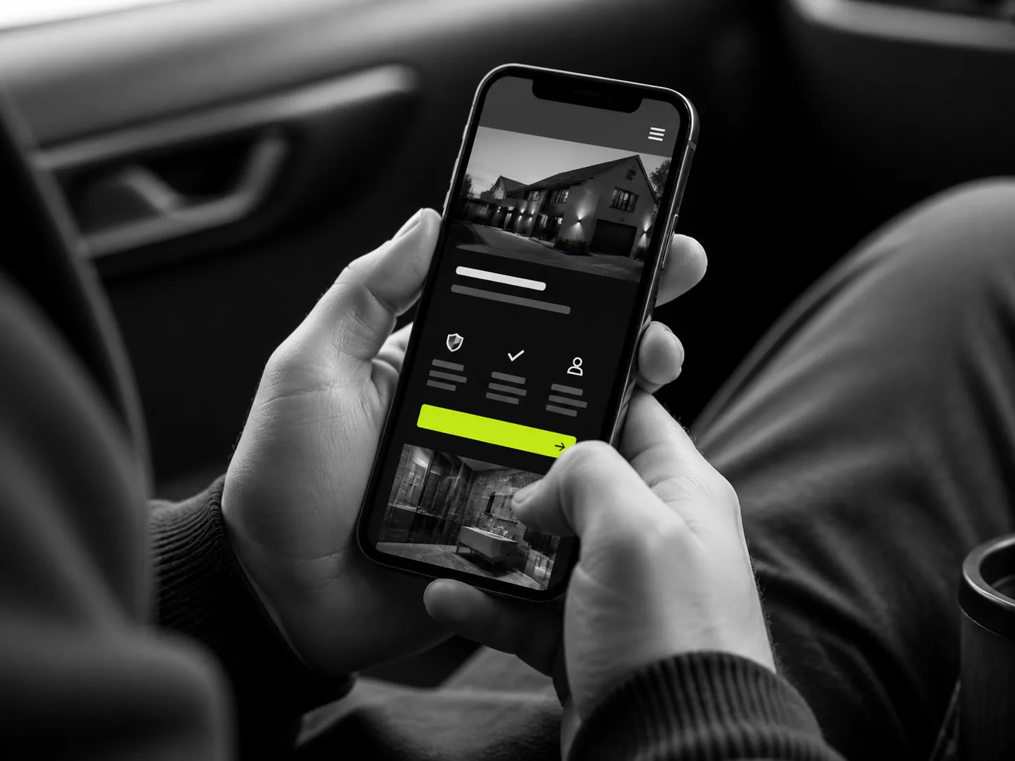
For many UK local businesses, mobile is not a secondary version of the website anymore. It is the main version customers see. They search while travelling, sitting at home, standing on a job, or trying to solve a problem quickly. If your mobile friendly website is hard to use, slow or awkward, the enquiry can disappear before you ever know it existed.
Ratiom reviews local business website performance with one simple question in mind: can a real customer understand the offer and make contact quickly on a phone? If the answer is no, the design is costing money.
Mobile Searches Are Often High Intent
A customer searching for a plumber, builder, clinic, accountant or installer on mobile is often closer to action than someone casually browsing on a laptop. They may need a quote, a call back, a booking or reassurance. A professional website should not slow them down.
Poor mobile website design loses enquiries quietly. Nobody phones to say the text was too small or the form was annoying. They simply press back and choose another business.
Common Mobile Mistakes
Tiny text
If customers have to pinch and zoom, the website is not doing its job. Body copy, service names and calls-to-action should be readable at normal phone distance.
Difficult navigation
Menus should be simple. A local business website does not need a maze. Services, areas, proof and contact details should be easy to reach.
Slow loading
Large unoptimised images, bloated scripts and heavy templates make people wait. A website for trades or local services should feel quick because customers are often comparing several options at once.
Non-clickable phone numbers
This is still common. On mobile, a phone number should open the dialler. WhatsApp should open WhatsApp. Directions should open maps. Every tap should help the customer move forward.
Long contact forms
A long form may be fine for complex enquiries, but it should not be the only option. Most local customers want to ask a simple question first. Short forms generate more enquiries because they reduce effort.
How to Improve Mobile Conversion
- Put the main service and area near the top of the page.
- Use large tap targets for calls, WhatsApp and quote requests.
- Keep forms short and ask only what you genuinely need.
- Compress images so pages load quickly on mobile data.
- Break long text into clear sections with useful headings.
- Test the website on an actual phone, not just inside a desktop preview.
A mobile friendly website is not only about fitting the screen. It is about matching how customers behave. They are impatient, distracted and comparing options. Ratiom designs every business website around that reality.
Responsive Is Not Always Enough
A technically responsive website can still be poor on mobile. If the order of content is wrong, the buttons are buried, or the images push important information too far down, it will still lose enquiries. A proper website redesign should think through the mobile journey from first impression to contact.
For a UK local business, mobile design is conversion design. When customers can read, trust and contact you quickly, the website has a better chance of turning visits into calls.
Mobile Customers Are Usually Multitasking
A desktop visitor may be sitting down with time to browse. A mobile visitor is often doing something else. They may be on lunch, between jobs, in a parked car, walking through a house, or trying to solve a problem before the end of the day. That changes how a local business website should be built.
Ratiom looks at mobile pages through that lens. The visitor should not need patience. They should not need to zoom. They should not need to decode a clever menu. A mobile friendly website should guide them quickly from need to confidence to contact.
The Top of the Page Matters More on Mobile
On a phone, the first screen is precious. If the top of the page is taken up by a huge image, vague headline or awkward spacing, the customer may not see the information that matters. For a website for trades, the first view should usually make the service, location and contact route obvious.
That does not mean cramming everything above the fold. It means being disciplined. A strong mobile homepage might show a clear service headline, a short trust-building line, a call button, a WhatsApp button and a visible route to services. If a customer has to scroll past decoration to understand the business, the design is working against conversion.
Speed Is Part of Trust
Slow loading feels unprofessional. Customers may not know why the website is slow, but they still form an opinion. Heavy images, unnecessary scripts and bloated templates can make a business website feel clumsy. On mobile data, the problem becomes worse.
Ratiom treats speed as a trust signal. A fast website feels more competent. It also keeps more people on the page long enough to read, compare and enquire. If a page takes too long to show useful content, your competitor may get the call.
Tap Targets Should Be Built for Real Fingers
Small links are one of the easiest ways to frustrate mobile users. Buttons should be large enough to tap without precision. Important actions should have enough spacing around them. If a visitor accidentally taps the wrong thing or cannot press the phone number easily, the experience feels careless.
Clickable phone numbers are essential. So are clear WhatsApp links if customers commonly use WhatsApp in your market. The aim is to make action feel immediate. A local business does not win by making customers work harder than necessary.
Forms Need Discipline
Long forms can be useful for complex work, but they should be used carefully. On mobile, every extra field creates effort. Ask for the minimum information needed to start the conversation. Name, contact detail, service needed and a short message is often enough.
If you need more detail, ask later. The first job of the website is to open the enquiry. Ratiom often improves website conversion by reducing form friction and giving customers more than one way to contact the business.
How to Audit Your Own Mobile Website
Do not only test your website on Wi-Fi at your desk. Use your phone. Turn off Wi-Fi. Open the homepage, a service page and the contact page. Try to call. Try to send a message. Try to find proof that the business is trustworthy. If any of that feels slow, cramped or confusing, customers will feel it too.
Then ask someone who does not know your business to do the same. Watch where they hesitate. That hesitation is useful. It shows where your website redesign should focus first.
Small Fixes Can Make a Noticeable Difference
You do not always need to rebuild everything at once. Start with the parts closest to enquiry. Make the main phone number tappable. Add a clear WhatsApp button. Shorten the contact form. Move the strongest review higher on the page. Replace a vague headline with one that names the service and location.
These changes sound simple because they are. But simple is often what customers need. Ratiom sees many mobile websites lose enquiries because they make ordinary actions feel harder than they should. A local business does not need a complicated mobile experience. It needs a clear one.
Need a Better Mobile Website?
Ratiom can review your current mobile experience and show where customers are dropping off before they contact you.
Ask Ratiom